
iOS Widget Apps: What You Need to Know in 2026
Your home screen is the most-seen page in your digital life. You glance at it dozens of times daily. Widget apps transform that passive real estate into an active dashboard — surfacing information, motivation, and quick actions without opening any app.
We evaluated 22 iOS widget apps across iOS and Android, scoring each on real user ratings, feature depth, and long-term value. This guide covers what we found.
The Science of Glanceable Information
You unlock your phone somewhere between 80 and 100 times per day. Each unlock is a glance — two to three seconds of visual attention before you either open an app or lock the screen again. This behavior is so habitual that most people dramatically underestimate how often they do it. When researchers ask people to estimate their daily phone unlocks, the typical guess is 30 to 40. The actual number, measured by screen time tracking, is reliably double that.
Widgets live in this glance window. Their entire value proposition depends on delivering useful information within that two-to-three-second attention span. A widget that requires reading a paragraph to understand has missed the point. A widget that demands interaction — tapping, scrolling, configuring — before providing value has misunderstood its medium. The best widgets work like the gauges on a car dashboard: a single visual signal that communicates status instantly. Fuel level. Speed. Engine temperature. You don't read a dashboard. You glance at it, absorb the information, and return your attention to the road.
The same principle applies to your home screen. A weather widget should show the temperature and a sky condition icon — not a five-day forecast that requires squinting. A habit tracker widget should show today's completion status as colored circles or checkmarks — not a paragraph about your weekly trends. A calendar widget should show your next event and how soon it starts — not your entire week.
The information density sweet spot for a widget is one to three data points. More than that, and the glance becomes a read, which breaks the interaction model. The widgets that people actually find valuable over time — the ones that survive the inevitable home screen reorganization two months after installation — are the ones that deliver their payload in under two seconds. Everything else is an app that should be opened when you have time to engage with it, not a widget that clutters your glance-and-go workflow.
Widget Strategy: What Belongs on Your Home Screen (and What Doesn't)
Your home screen is attention real estate, and like physical real estate, its value depends entirely on what you build on it. Most people fill their home screens reactively — adding widgets as they discover them, never removing ones that have outlived their usefulness, accumulating visual clutter that dilutes the value of every individual widget. A deliberate widget strategy starts with a simple question: what information do I need to see often but don't need to interact with?
The most valuable widgets display information you check frequently but that doesn't require action. Your schedule for the next few hours. Today's weather. Your habit completion status. A countdown to an important date. These are monitoring widgets — they keep you informed without pulling you into an app. Every glance at your schedule widget is a glance that didn't become a five-minute detour through your calendar app, which didn't become a ten-minute reorganization of next week's meetings.
The least valuable — and potentially most harmful — widgets display information that triggers compulsive checking. An email count widget creates anxiety with every new number. A social media notification widget pulls you into feeds designed to consume your attention. A news headline widget interrupts your day with information you can't act on. These widgets don't inform or motivate. They distract. They turn every phone unlock into an invitation to get pulled off course.
Curate your home screen the way you would curate a workspace. Every object on a well-organized desk serves a purpose: the tools you use daily are within reach, the reference materials you check regularly are visible, and everything else is stored elsewhere. Your home screen should follow the same logic. The widget that shows your daily step count earns its place if fitness matters to you. The widget that shows your investment portfolio does not earn its place if checking it three times a day makes you anxious.
A practical test: for each widget on your home screen, ask whether it has changed your behavior or improved your day in the past week. If the answer is no, it is occupying space that could serve you better. Remove it, and notice whether you miss it. Most people discover they don't.
Aesthetic Widgets vs Functional Widgets: Where the Market Split
When Apple introduced home screen widgets with iOS 14 in September 2020, the feature was intended as a productivity enhancement — a way to surface useful information without opening apps. What happened instead was an aesthetic revolution. Within weeks, the dominant use case wasn't checking your calendar at a glance. It was making your home screen beautiful.
The widget app market split into two distinct camps almost immediately. Aesthetic widget apps — Widgetsmith was the breakout hit — let users create custom widgets that matched their wallpapers, displayed personal photos in carefully styled frames, used custom fonts and color palettes, and turned the home screen into a curated visual experience. The appeal was real: people spend hours looking at their phones, and wanting that experience to be visually pleasant is entirely reasonable.
Functional widget apps took the opposite approach. They focused on displaying live data — weather forecasts, habit tracking, calendar events, health metrics, task lists — with clean, information-dense designs. The aesthetic was secondary to the utility. These apps wanted to make your home screen a dashboard, not a gallery.
The tension between these two camps persists because they serve fundamentally different needs, and those needs rarely overlap cleanly. A beautiful photo widget that matches your ocean-themed wallpaper is not showing you useful information. A dense calendar widget displaying your next five appointments is not contributing to visual harmony. When you try to serve both masters — making a widget both beautiful and functional — you typically compromise both. The calendar widget gets simplified until it only shows one event (aesthetic wins, function loses). The photo widget gets overlaid with a clock (function wins, aesthetic loses).
Knowing which camp you're shopping in saves time and disappointment. If your goal is a cohesive, magazine-worthy home screen — matching colors, custom icons, photo widgets that create a visual theme — you want aesthetic apps, and you should evaluate them on design flexibility, template quality, and how well they integrate with your wallpaper. If your goal is a productive home screen that surfaces the information you need throughout the day, you want functional apps, and you should evaluate them on data accuracy, update frequency, and information density.
The few apps that genuinely bridge both camps — offering real data in genuinely beautiful presentations — command premium prices and loyal followings. They are rare because the design challenge is genuinely hard: making information dense enough to be useful and beautiful enough to belong on a curated home screen requires a level of design sophistication that most app teams don't achieve.
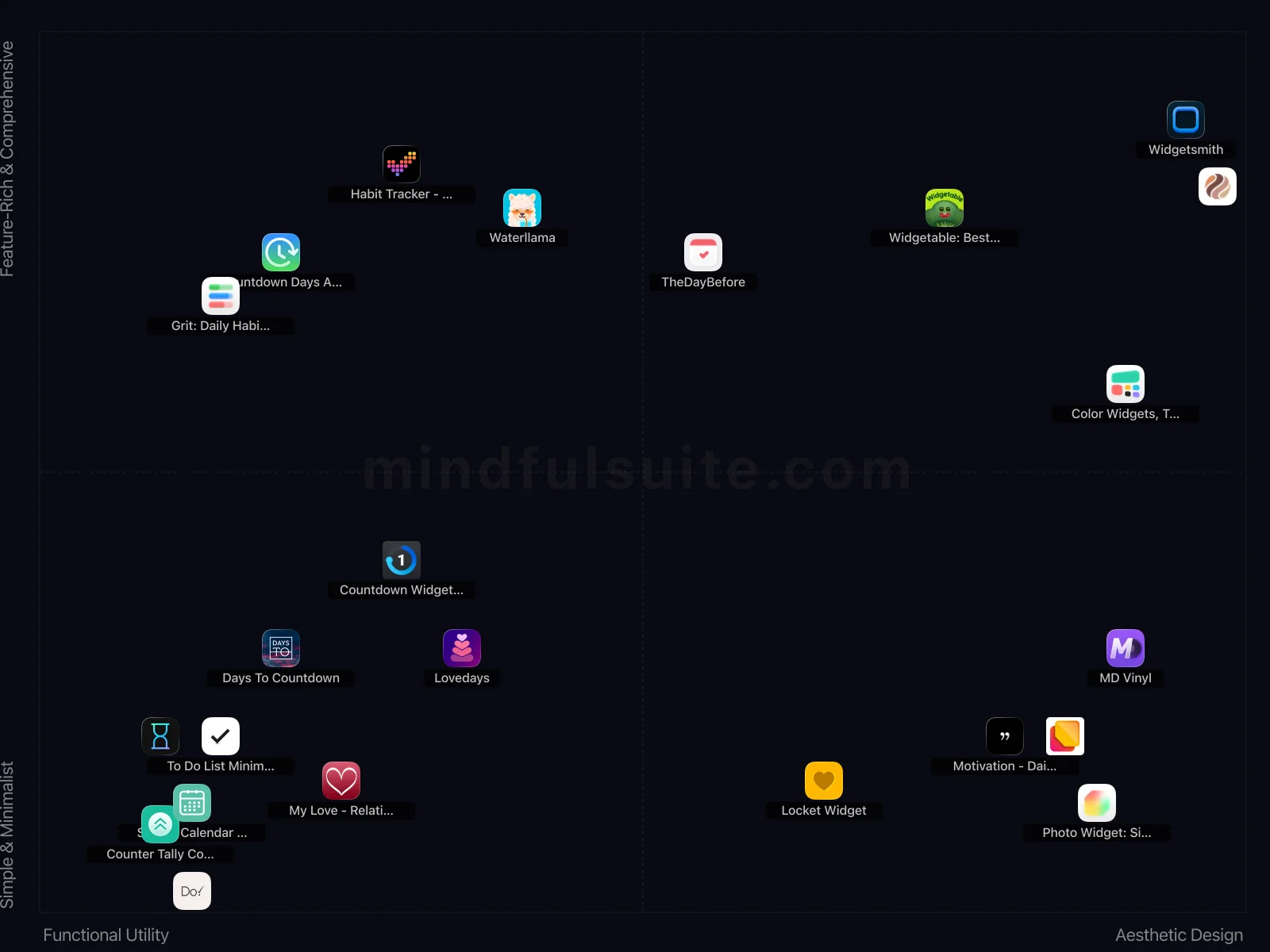
4 Types of iOS Widget Apps — and How They Differ
These 22 apps don't all solve the same problem. They cluster into 4 distinct groups, each built around a different philosophy. Understanding which group fits you is the fastest way to narrow your search.
Functional Utility + Feature-Rich & Comprehensive
4 apps in this group, led by ![]() Grit: Daily Habit Tracker,
Grit: Daily Habit Tracker, ![]() Waterllama, and
Waterllama, and ![]() Habit Tracker - Evoday.
What defines this cluster: free with iap, habit tracker, adhd planner, routines and goals.
Habit Tracker - Evoday.
What defines this cluster: free with iap, habit tracker, adhd planner, routines and goals.
Aesthetic Design + Feature-Rich & Comprehensive
5 apps in this group, led by ![]() Widgetable: Besties & Couples,
Widgetable: Besties & Couples, ![]() Widgetsmith, and
Widgetsmith, and ![]() TheDayBefore.
What defines this cluster: interactive sharing widgets, customizable lock/home screens, schedule management, anniversary/birthday reminders.
TheDayBefore.
What defines this cluster: interactive sharing widgets, customizable lock/home screens, schedule management, anniversary/birthday reminders.
Functional Utility + Simple & Minimalist
8 apps in this group, led by ![]() Counter Tally Count,
Counter Tally Count, ![]() Days To Countdown, and
Days To Countdown, and ![]() Simple Calendar - SimpleCal.
What defines this cluster: free with iap, simple tally counter, countdown to special days, home screen widgets.
Simple Calendar - SimpleCal.
What defines this cluster: free with iap, simple tally counter, countdown to special days, home screen widgets.
Aesthetic Design + Simple & Minimalist
5 apps in this group, led by ![]() Locket Widget,
Locket Widget, ![]() Motivation - Daily quotes, and
Motivation - Daily quotes, and ![]() Photo Widget Easy.
What defines this cluster: send photos, widget based, photos on home screens, free (iap).
Photo Widget Easy.
What defines this cluster: send photos, widget based, photos on home screens, free (iap).
What makes them different
The core tension in this category runs along two axes. On one side, Functional Utility apps prioritize simplicity and speed — you can be up and running in under a minute. On the other, Aesthetic Design apps offer depth and customization that rewards investment over time.
The second axis — Complexity — captures an equally important difference. Apps closer to Simple & Minimalist take a fundamentally different approach than those near Feature-Rich & Comprehensive. Neither is objectively better. The right choice depends on your personality, your experience level, and what you're trying to accomplish.
22 Apps Reviewed
We scored every app using a weighted composite of real App Store and Google Play ratings. Out of 22 apps: 17 Essential · 4 Hidden Gems · 1 Popular. 9 cross-platform, 13 iOS-only.
Top picks: ![]() Do! - Simple To Do List and
Do! - Simple To Do List and ![]() TheDayBefore scored highest overall.
TheDayBefore scored highest overall. ![]() Days To Countdown rounds out the top three. Switch to the Apps tab for the full list with ratings and download links.
Days To Countdown rounds out the top three. Switch to the Apps tab for the full list with ratings and download links.
How to Pick the Right One
Look at the cluster section above. If you already know whether you want Functional Utility or Aesthetic Design, that eliminates half the options instantly. Same for Simple & Minimalist vs Feature-Rich & Comprehensive.
Try one app for a full week before judging. Most iOS widget apps reveal their value around day 5, not day 1.
Quick start: ![]() Do! - Simple To Do List and
Do! - Simple To Do List and ![]() TheDayBefore represent two different approaches and both scored highest. Pick whichever resonates, switch if it doesn't click.
TheDayBefore represent two different approaches and both scored highest. Pick whichever resonates, switch if it doesn't click.
Making It Stick: Practical Advice
Downloading the app is the easy part. The hard part — the part that actually produces results — is what happens in weeks two, three, and beyond. These tips are drawn from behavioral research and from patterns we've observed across hundreds of thousands of user reviews. They're not revolutionary, but they work:
Put your most important tracking widget on page one
The widget you see most is the one that influences your behavior. Put your key habit, goal, or schedule widget where you can't miss it.
Less is more
Too many widgets create visual clutter and slow down your phone. Curate ruthlessly — each widget should earn its place on your home screen.
Frequently Asked Questions
These are the questions that come up most often — from our own testing, from user reviews, and from the broader conversation around iOS widget apps. If your question isn't here, the Apps tab has detailed information on every app we reviewed.
Do widgets drain battery?
Most widgets update periodically (not constantly), so battery impact is minimal. Widgets with real-time data (weather, fitness) use slightly more battery than static ones, but the difference is negligible for most users.
Can I use widgets from different apps together?
Absolutely. You can mix widgets from any compatible app on the same home screen page. This lets you create a custom dashboard combining your calendar, habits, weather, and more.
Unleash Your Home Screen: The Ultimate Guide to the Best iOS Widget Apps (2026)
Remember when your iPhone's home screen was just a neat, orderly grid of app icons? It was functional, sure, but a little like a digital filing cabinet—all business, no personality. You’d tap, swipe, and jump between apps just to piece together your day: one for the calendar, another for the weather, a third for your to-do list.
Widgets changed everything. They smashed open that static grid and turned your home screen into a living, breathing dashboard. Imagine glancing down and seeing a favorite photo from your last vacation, your next meeting glowing beside the current weather, and a tiny, spinning vinyl record playing your afternoon focus playlist. This isn't just about making your phone look cool; it's about making it work for you, bringing the information you need right to the surface. Ready to transform your home screen from a simple launcher into a personal command center? Let's dive in.
For Ultimate Customization & Aesthetics
These apps are for the inner designer in all of us. They let you tear down the standard iOS look and craft a home screen that’s uniquely yours—though be prepared to spend some time tweaking the finer details to get it just right.
Awareness
A time visualization app that helps you beat time blindness with 25+ unique ways to see time passing across iOS, Apple Watch, and Mac.
- 25+ unique ways to visualize time passing (hours, days, weeks, months, years, life).
- Excellent Apple Watch integration and haptic reminders.
- Mac app provides detailed analytics.
Vision
A vision board app that keeps your goals always visible on your lock screen with custom widgets, backgrounds, and an extensive motto library.
- Always-visible vision board through iOS 26 widgets.
- Extensive motto library covering anxiety, ADHD, self-acceptance, and atomic habits.
- Beautiful custom background layouts and dynamic effects.
Widgetsmith
The undisputed king of customization, [Widgetsmith](https://apps.apple.com/us/app/widgetsmith/id1523682319) gives you the creative freedom to build widgets from the ground up. You can design widgets for weather, calendars, photos, astronomy, and more, each with granular control over fonts, colors, and layouts.
- Offers unparalleled customization for personalizing widgets with photos, fonts, and unique color schemes.
- Its smart scheduling feature allows widgets to change dynamically throughout the day, which is genuinely clever.
Color Widgets, Theme: iWidgets
Offers customizable widgets like clocks and calendars to personalize the look of your phone's home screen.
Photo Widget: Simple
Sometimes, all you want is a picture of your loved ones, pets, or a favorite memory on your home screen. [Photo Widget: Simple](https://apps.apple.com/us/app/photo-widget-simple/id1532018817) does exactly that, and does it perfectly. Create beautiful photo albums and let them cycle through your day.
- Offers a simple, effective way to showcase personal photos directly on your home screen in various sizes.
- Setting up photo albums for rotation within widgets is incredibly straightforward and intuitive.
ScreenKit
[ScreenKit](https://apps.apple.com/us/app/screenkit-app-icons-widgets/id1534017393) is your all-in-one solution for a complete home screen makeover. It goes beyond widgets, offering over 5000 custom app icons and dozens of themes to create a cohesive aesthetic.
- Offers a massive collection of aesthetic icon packs and themes to dramatically personalize your iPhone's appearance.
- The ability to easily change app icons provides a level of visual customization unmatched by native iOS.
For Productivity & Organization
Stop hunting for your to-do list and turn your home screen into mission control. These widgets pull your tasks, habits, and calendars out of their silos and put them right where you can't ignore them.
To Do List MinimaList & Widget
A simple to-do list and task manager app with a clean interface and widget support. This is a basic and minimalist approach to productivity.
- Minimalist design truly reduces visual clutter, making task management less overwhelming for distracted minds.
- Intuitive widget functionality provides quick glances at priorities without needing to open the full application.
Do! - Simple To Do List
This is a basic to-do list application.
- Delivers on its promise of extreme simplicity, making task creation and management incredibly fast and direct.
- Its minimalist design avoids feature bloat, offering a refreshing alternative to complex productivity suites.
Simple Calendar - SimpleCal
SimpleCal is a basic calendar app designed for ease of use.
- Lives up to its name with a genuinely minimalist interface, prioritizing quick event creation and clear viewing.
- The integrated task and to-do list functionality within the simple calendar view is surprisingly effective.
Pomodoro - Focus Timer
A straightforward Pomodoro Technique timer app for productivity.
- Its bold claim as "The Best Pomodoro Application" is backed by strong ratings and a massive Android user base.
- Offers a straightforward, effective Pomodoro timer experience, helping users implement focused work sessions easily.
Counter Tally Count
A basic digital tally counter that allows users to increment and decrement a number, useful for counting anything from attendees to inventory.
- The app’s ability to manage multiple counters with custom names and values is incredibly efficient for various tasks.
- Its "digital number clicker" functionality is perfect for quick, repetitive counting, like inventory or exercise reps.
For Information At-a-Glance
Get the data you need before you even open an app. Whether you're counting down to a massive vacation or just keeping tabs on an upcoming exam, these widgets turn your screen into a dynamic, stress-reducing info-hub.
TheDayBefore
Meet the crowd-pleaser. TheDayBefore is a superstar on both iOS and Android, designed to help you beautifully manage every important date in your life—from anniversaries and exams to birthdays and holidays. Its library of gorgeous widgets is a huge plus.
- The wide variety of stylish widgets allows extensive home screen personalization and decoration.
- Its focus on managing diverse event types like anniversaries and exams makes it truly versatile.
Days To Countdown
This one is a bit of a mystery. It promises simple countdowns, widgets, and notifications, but there's very little information available about its performance or user satisfaction. It might be a simple, no-frills tool, but it's a bit of a gamble.
- Its straightforward simplicity makes setting up new countdowns incredibly quick and fuss-free.
- Customizable notifications are genuinely helpful for ensuring you never miss an important milestone.
For Health & Fitness
It's remarkably easy to forget to drink water or log a daily habit when the app is buried in a folder on page three. Keep your wellness goals front and center with these gentle, visual nudges.
Habit Tracker - Evoday
This habit tracker helps users build habits with progress tracking on grids, calendars, and widgets.
- The beautiful visual progress tracking through grids, calendars, and widgets makes monitoring streaks genuinely satisfying.
- High user engagement and excellent ratings across both platforms confirm its effectiveness and polished experience.
Waterllama
Staying hydrated is simple self-care, and Waterllama makes it fun. This creative water tracker uses cute characters and challenges to motivate you to drink enough water throughout the day.
- The cute animal companions and gamified tracking make hydration genuinely engaging and less of a chore.
- Waterllama differentiates by offering unique drink types like coffee and juice, providing a more realistic intake overview.
Grit: Daily Habit Tracker
A habit tracker designed to empower users in building routines and achieving goals. It is for people who need a tool to plan and monitor their habits effectively.
- The "ADHD Planner" feature indicates specialized design choices, like minimal distractions or simplified interfaces, beneficial for focus.
- A perfect 5-star Android rating, though from limited reviews, suggests an exceptionally well-designed and stable experience on that platform.
For Music, Social & Lifestyle
Your phone doesn't have to be all work and no play. Infuse your home screen with a bit of joy, whether that's a nostalgic spinning vinyl record or a live photo portal connecting you directly to your best friend.
Widgetable: Besties & Couples
Offers interactive widgets for home and lock screens so users can share moments with close friends and loved ones. It focuses on social connection through visual sharing.
- The unique interactive widgets like 'mood,' 'distance,' and 'status' genuinely foster connection with specific contacts.
- It transforms your lock screen into a dynamic, personalized canvas for shared memories and real-time updates.
Locket Widget
[Locket](https://apps.apple.com/us/app/locket-widget/id1600525061) is a social widget that creates a private portal to your closest friends' home screens. When a friend sends a photo, it instantly appears in the Locket widget on your screen, offering a delightful and intimate way to share moments.
- The core concept of sharing live photos directly to a friend's home screen widget is genuinely unique and intimate.
- It fosters a delightful, spontaneous connection with close contacts, unlike traditional social media feeds.
Motivation - Daily quotes
This app is a titan in the motivation space for a reason. It's a straightforward and powerful engine for inspiration, delivering quotes and reminders on a huge range of topics to help you sprinkle positivity throughout your day.
- The customizable widgets deliver impactful quotes directly to your home screen, making daily inspiration effortless.
- You can browse quotes by specific categories like "self-esteem" or "relationships," ensuring relevant content.
MD Vinyl
Add a touch of analog charm to your digital music. [MD Vinyl](https://apps.apple.com/us/app/md-vinyl-music-widget/id1524263236) displays your currently playing song from Apple Music or Spotify as a beautiful, spinning vinyl record.
- The nostalgic spinning vinyl record widget design is a unique and charming aesthetic for music playback.
- It seamlessly integrates with Apple Music and Spotify, displaying current track information beautifully.
My Love - Relationship Counter
It simply counts the days you and your partner have been together, displaying the relationship length.
- Its singular focus on relationship duration makes it perfectly tailored for couples tracking their time together.
- The dedicated interface and features are much more intimate than a generic countdown app.
Lovedays
Similar to Been Together, Lovedays is a D-Day counter for couples. It helps you keep track of anniversaries and other important dates with a visually appealing and customizable interface.
- The customizable D-Day counter and intuitive widgets make tracking anniversaries incredibly convenient.
- Its clean interface specifically focuses on commemorating important dates, keeping things simple and clear.
Don't Forget Apple's Built-in Widgets
Before you fill your phone with third-party apps, remember that Apple provides some excellent widgets right out of the box. While third-party tools offer immense power and granular customization, exploring the native options available on iOS is always a brilliant starting point for keeping your home screen efficient, contextual, and beautifully integrated without draining your battery.