 AmelioVersion 2026.9.101
Reactions, calmer colour, and a simpler Progress
React and reply with the feeling characters, a quieter look, a Progress tab that reads like a report, and tabs that open straight away.
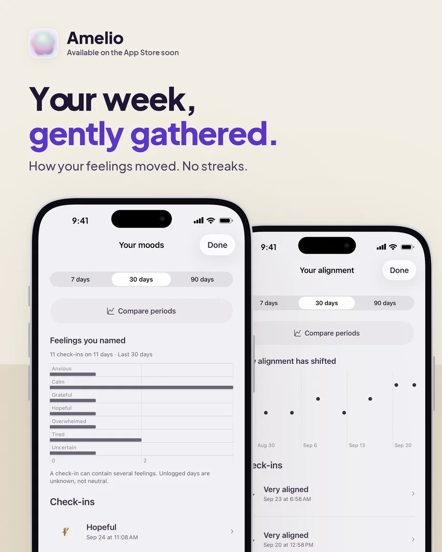
A big look-and-feel update. Amelio should feel calmer to open and simpler to move around.
React with a feeling
Reactions are now the same 36 characters you check in with. Tap the smile under a post, swipe through, and pick the one that fits. Changed your mind? Tap it again to take it back.
Replies that know who they're for
The reply box now says who you're answering, by name, and quotes the message — which stays in view above it. Tap any message to answer it, or ✕ to back out. You can send a feeling too: it sits on the corner of the message you're answering, with its name, and you can change or remove it by pressing and holding.
A calmer look
- Posts are white cards on a light page. Something you wrote has a folded corner and opens with "I wrote"; check-ins open with "I noticed" or "I felt".
- Icons are one consistent set, at one weight. Reply is an arrow; share is the box with an arrow.
- Your accent colour tints buttons and the pills you've picked, and nothing else — pages and cards stay neutral, so your colour stands out instead of taking over. Settings → Appearance opens with a live preview.
- The + button opens a floating list of everything you can share, and the tab bar steps aside while you type.
- On a profile, the filter icons scroll inside their glass bar while the bar stays put.
A simpler Progress
- One card for each kind of check-in. A quiet week is a single line with a shortcut to log one; tap any card for its full page.
- The numbers under your recap say what they count: your check-ins, the days you checked in, and how that compares with the same number of days before.
- Highlights arrive four at a time, in a fresh order each day. Reactions, replies, sharing and the time of day each have their own icon.
- Share any highlight, or your recap, as a post to your circle or as a square image.
- Each kind of check-in has its own report: your check-ins and days drawn at the top, then each chart under its heading. With fewer than three check-ins it shows what you logged and doesn't read anything into it yet.
- Comparisons show your top three before and now, with a gentle note on what the change might mean — once there are three check-ins on each side.
Quicker to open
- Tabs open on what Amelio already knows: People shows everyone's latest activity at once, Progress opens on your last numbers, and faces load from your phone. Everything refreshes quietly behind.
- While something does load, its outline matches what arrives.
Also fixed
- Message Amelio: the letter field is no longer hidden under the tab bar.
- A screenshot, a banner or leaving the app no longer makes a post or the feed reload.
- Deleted replies disappear instead of leaving a placeholder.
- The privacy icon on your posts is a little bigger and bolder.
New to Amelio? See what it's for →