 AmelioVersion 2026.9.99
Reactions, calmer colour, and a simpler Progress
Six gentle reactions for your friends' posts, a quieter look across the app, and a Progress tab that shows one card per kind of check-in, with numbers that explain themselves.
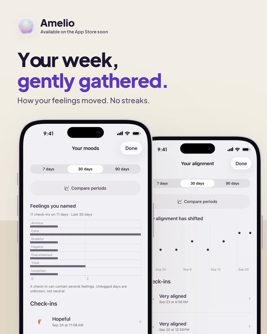
A big look-and-feel update. Amelio should feel calmer to open and simpler to move around.
React the way you mean it
There are now six reactions — Like, Love, Care, Celebrate, Inspired and Me too — shown as soft round badges. Tap the smile under a post to pick one. Changed your mind? Tap it again to take it back.
A calmer look
- Posts are white cards on a light page. Something you wrote has a folded corner and opens with "I wrote"; check-ins open with "I noticed" or "I felt".
- Icons are one consistent set, at one weight. Reply is an arrow; share is the box with an arrow.
- Your accent colour tints buttons and the pills you've picked, and nothing else — pages and cards stay neutral, so your colour stands out instead of taking over. Settings → Appearance opens with a live preview.
- The + button opens a floating list of everything you can share, and the tab bar steps aside while you type.
- On a profile, the filter icons scroll inside their glass bar while the bar stays put.
A simpler Progress
- One card for each kind of check-in. A quiet week is a single line with a shortcut to log one; tap any card for its full page.
- The numbers under your recap say what they count: your check-ins, the days you checked in, and how that compares with the same number of days before.
- Highlights arrive four at a time, in a fresh order each day. Reactions, replies, sharing and the time of day each have their own icon.
- Share any highlight, or your recap, as a post to your circle or as a square image.
- Comparisons show your top three before and now, with a gentle note on what the change might mean.
New to Amelio? See what it's for →